Main Effects Plot
SPC XL 2010 supports a new feature called "Main Effects Plot". This feature plots an average of each subscript in a line graph making differences in the data easier to find. The unique aspect of this feature is that the data must be in database or flat file format. This is different in that most of the analysis done in SPC XL requires that the data be in rows or columns.
Simple Example
Source Data
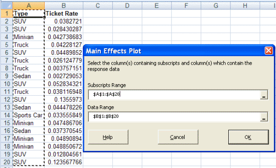
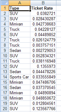
The left column has subscripts or groups. Data from a database commonly comes in this format.
Select "SPC XL" - "Quality Tools" - "Main Effects Plot".
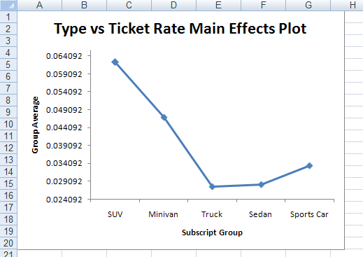
The resulting plot calculates the average Ticket rate for each type of vehicle.
Advanced Example
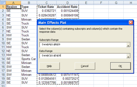
Both the Subscripts and the data range can be more than one column. For example, with the following data,
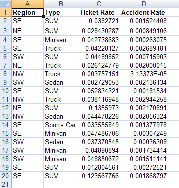
... if you unstack using columns A and B as the subscripts and columns C and D as the data range...
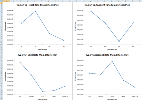
... this is the result.


